Sobre el projecte
Tipografia DIN
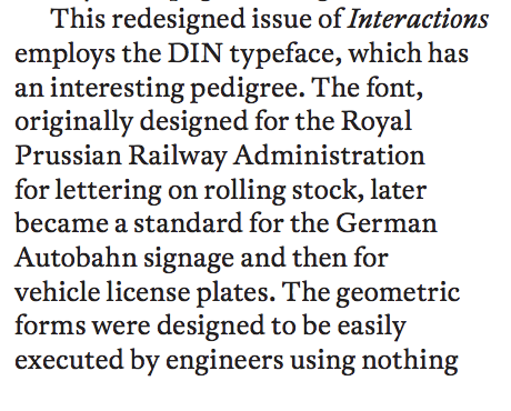
La font, originalment dissenyada per a la Royal Prussian Railway Administration per a les lletres del material rodant, es va convertir més tard en un estàndard per a la senyalització alemanya d'Autobahn i després per a plaques de vehicles. Les formes geomètriques van ser dissenyades per ser fàcilment executades per enginyers que utilitzaven res més que compassos i regles.
Àrea:
Àmbit:
Subàmbit:
Conceptes relacionats:
Referència:
Hayman, Luke. Redesigning interactions [article-PDF]. Publicat en Magazine interactions, volum 21è, primera edició, pàgines 6 i 7, Gener-Febrer 2014, Nova York, Estats Units, 2014. [data de consulta: 9 de maig 2018]. Disponibilitat i accés: https://dl.acm.org
Vincle:
Imatge:
Fitxer:
Text:
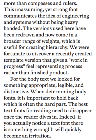
This redesigned issue of Interactions employs the DIN typeface, which has an interesting pedigree. The font, originally designed for the Royal Prussian Railway Administration for lettering on rolling stock, later became a standard for the German Autobahn signage and then for vehicle license plates. The geometric forms were designed to be easily executed by engineers using nothing more than compasses and rulers. This unassuming, yet strong font communicates the idea of engineering and systems without being heavy handed. The versions used here have been redrawn and now come in a broader range of weights, which is useful for creating hierarchy. We were fortunate to discover a recently created template version that gives a "work in progress" feel representing process rather than finished product. For the body text we looked for something appropriate, legible, and distinctive. When determining body fonts, it is important to hold back— which is often the hard part. The best text fonts for reading need to disappear once the reader dives in. Indeed, if you actually notice a text font there is something wrong! It will quickly become an irritation.